I've decided to paint the back of my glass tank with acrylic paint. Normally you see all blue or all black or a light to dark pattern. My question is this. If i painted my tank a different color such as green, or red, or pink(my girlfriends idea). Does that effect the fish in any way?
You are using an out of date browser. It may not display this or other websites correctly.
You should upgrade or use an alternative browser.
You should upgrade or use an alternative browser.
Tank background Color Question
- Thread starter mr_bigl
- Start date
r-balljunkie
Registered Reefer
i wouldnt think so.
i thought of doing another color, but it would clash with my overflows, so decided to keep it simple.
have you thought of using a vinyl sticker? its cheaper and removable.
im doing mines, under 10 bux.
i thought of doing another color, but it would clash with my overflows, so decided to keep it simple.
have you thought of using a vinyl sticker? its cheaper and removable.
im doing mines, under 10 bux.
Indymann99
New member
If you paint your tank background PINK.... all your fish will swim around with purse dogs.
If you paint your tank background PINK.... all your fish will swim around with purse dogs.
:lolspin:
BeanAnimal
Premium Member
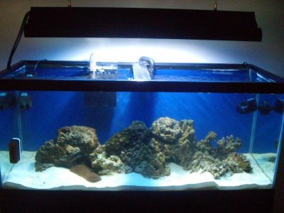
Stick with black ") The lighter the color, the less your corals and fish show up. People use blue in an attempt to achieve an "endless" ocean look, but instead get a washed out look. Just my opinion.
The lighter the color, the less your corals and fish show up. People use blue in an attempt to achieve an "endless" ocean look, but instead get a washed out look. Just my opinion.
The lighter the color, the less your corals and fish show up. People use blue in an attempt to achieve an "endless" ocean look, but instead get a washed out look. Just my opinion.jacksonpt
New member
stick with black
+1
Henry Bowman
Reefing since '87
At one time I thought about painting the bottom 1/3 black, then fade from dark to light blue moving toward the top of the tank to create more depth ? Never did it but it's a thought.
der_wille_zur_macht
Team RC
The planted freshwater community is typically far more "experimental" with backgrounds than reefers.
One common technique is to use semi-translucent material and backlight it. This creates the progression Henry is talking about, but with a far more natural look than actually painting different hues to attempt the fading look.
Black backgrounds do indeed seem to show off colors well, especially in smaller tanks, but it strikes me that it lends a vastly un-natural appearance to the reef when compared to (most) natural reefs.
BeanAnimal
Premium Member
I think it looks more natural, as your eyes are focused on the livestock and not the light colored background. When you are underwater, the background has depth and fades into the distance with the livestock that is also fading into the distance. You don't get that depth with a background in an aquarium. At least I don't.
I have honestly never seen a blue background that made the tank look appealing or natural (at least to me). Of course each of us sees and perceives differently. I certainly can't knock somebody for using what appeals to them.
I have honestly never seen a blue background that made the tank look appealing or natural (at least to me). Of course each of us sees and perceives differently. I certainly can't knock somebody for using what appeals to them.
der_wille_zur_macht
Team RC
I agree, blue backgrounds often look unnatural.
I guess my problem is that I have yet to see a background that strikes me as "natural." I think the only reason why black is the default is because it's the least obtrusive. But like you said, it's highly personal and subjective.
I guess that's what leads me to suggest background methods that are easily alterable, in case the hobbyist changes their mind. It's easier to change out a sheet of vinyl or acrylic compared to scraping off paint.
BeanAnimal
Premium Member
Yes it may be that the least obtrusive or noticeable is perceived as more natural just because it is less noticeable.
I am also not a fan of painted backgrounds. I use the Perfect background that comes in a roll. They have a part number that is black on one side blue on the other. Stick on vinyl from a sign shop would also work well, as would cling on vinyl.
I am also not a fan of painted backgrounds. I use the Perfect background that comes in a roll. They have a part number that is black on one side blue on the other. Stick on vinyl from a sign shop would also work well, as would cling on vinyl.
reefkeepa14
New member
blaccckkkk! and use that vinyl tape they use to make car decals. sticks in instantly..but u can wet it first so its plyable and can peel off it you make a mistake. down the line, once dry it also peels away like tape.
ka2zesmi786
New member
black background is a must! +1 to everyone that has it on their tank.
reef_keeper
New member
BeanAnimal
Premium Member
Proving the age old saying that "beauty is in the eyes of the beholder"...
Newreeflady
New member
Proving the age old saying that "beauty is in the eyes of the beholder"...
And, there you have it
I tried blue on my 20g- It's not bad, mostly because I used a sheer cover of it that helps it to look rather more deep than just a flat look. I think I'll go with black again next time, though, because it does let the coral really show its stuff. I'll make is sheer on the first coat, then do blue sheer on the second coat. This should come out dark, but not a flat look, and it should be ambiguously dark (not black, nor blue). I use Krylon. I tried those colored films people talk about, but mine always get water behind them and then you can see the beads sticking in some places against the two surfaces, and not in other places. I prefer to use the Krylon Fusion.
-A
Indymann99
New member
I like mine black.. of course 3 sides are black acrylic so no chance of changing...

Similar threads
- Replies
- 9
- Views
- 146