Blue or Black Background?

I like blue, looks more like drop offs in the ocean. Here is a pic I took while scuba diving on the Barrier last summer, the blue is a 150 foot drop off


pic_00502.jpg
 
That is very cool! When I first looked at it I thought you had painted it until I read! Hmmm! I wonder if Home Depot could match that color!
 
blue for me. black looks like you're looking at an alien planet not an ocean reef imho.

I made an LED background using translucent blue 2051 plexiglass. The color is pretty dark when the LEDs are off. I'm currently working on the electronic dimmer (with help of others here). I plan to let the brightness ramp down slowy so that its not completely off until after midnight. this should give a deep ocean look even when the MH is off, as in the ocean when its not super bright you can stil perceive the blue depth.

167670lightbox_03.jpg


167670lightbox_01.jpg

the camera isnt picking up the gradient right. these pictures are with the full LED array at 100% brightness. in actual use I dont think I will run at full brightness.

here is the effect I am trying to achieve (real photo):
Coral%20reef-Small.jpg


imagine that photo in black and suddenly youd be in space. *ducks*
 
That is a cool idea to use LEDs and plexiglass. Please post pics when you have it set up with your tank...not to hijack this thread though!
 
<a href=showthread.php?s=&postid=11954122#post11954122 target=_blank>Originally posted</a> by JimKelly12203
No doubt! It's not even close.

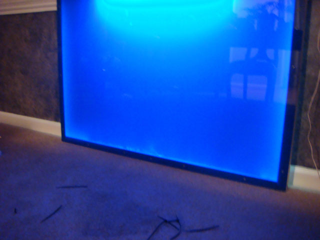
As for color, i'd say that blue should be the choice of anyone that wants their tank to look bigger than it really is, while black should be the choice of those that want to portray color contrasts and give a sense of your tank being a contained "neat" piece of artwork.

For me, blue. But i'm basing this on pictures of other tanks.

I like that description alot.

Blue is conducive to showing off sillhouettes of dark objects. so if your aquascaping is pillars and caves, you'll have alot of cool sillhouette but the overall emphasis will be on the negative space, and how light is drawn down through it.

I can certainly see why for some displays this is not ideal. really depends on if you're more trying to highlight the shape of an overall environment or highlight elements in the foreground more (which black is perfect for).
 
I vote for blue with a black racing stripe.

So forgive me if I am completely wrong, but I believe black absorbs all wavelengths of light and reflects none back, while blue reflects blue light back (that is why we see it as blue). So if you are using lights that are primarily in the blue wavelength you would be losing a ton of light with a black background.
 
Back
Top