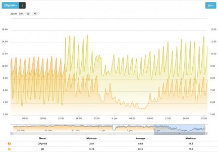
This is the comparison of the probes. I finally got both on the same scale so it is easier to see. There is quiet a bit of difference, especially near the zero to higher mV ranges. The curves look different too. This may be a result of the way Apex is visually rounding the data.
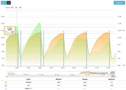
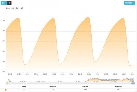
I still don't have an obvious nitrate knee, at least visually to me, even with a second dose of carbon.
Aaron
The first 3 cycles have a knee that is present. The last 2, not that I can see. The easy way to see it, other than waiting for Klaus to invert the graph and apply slope indicators
") , is to hold a business card up against the monitor. Line up the straight edge of the card to measure the slope. In the first 3 graphs you will see that a knee occurs and after that point the slope becomes more vertical until the low point (high point) is reached and the cycle is terminated.
, is to hold a business card up against the monitor. Line up the straight edge of the card to measure the slope. In the first 3 graphs you will see that a knee occurs and after that point the slope becomes more vertical until the low point (high point) is reached and the cycle is terminated.Dennis