- Forum
- More Forums
- Reef Club Forums
- SouthWest Region-Reef Club Forums
- Central Oklahoma Marine Aquarium Society
You are using an out of date browser. It may not display this or other websites correctly.
You should upgrade or use an alternative browser.
You should upgrade or use an alternative browser.
COMAS logo
- Thread starter OkR33Fer
- Start date
chaderic26
New member
There used to be another logo on the site that looked good. What ever happened to it?

madkat
New member
There used to be another logo on the site that looked good. What ever happened to it?
90% of the old site was destroyed by a disgruntled ex-member. The only one we have now is the one I created and placed up on the new site.

chaderic26
New member
Bummer. To bad who ever made it doesn't have a copy.
Travis L. Stevens
New member
I *might*, and I stress MIGHT have a copy running around in my old files. I wasn't the disgruntled member, but I do have some of that old stuff. I know I still have copies of the first annual CRASE stuff ")
Travis L. Stevens
New member
Found one!
Old Logo

One that I tinkered with

Old Logo
One that I tinkered with
Travis L. Stevens
New member
Jeeze! Didn't realize the one I tinkered with was so large. But I think I know why. I needed to make the logo larger, but in order to do it I had to rework it. So, I might as well have added some high res photos to it as well.
Reef Happy
New member
Very nice.
lauremf2002
New member
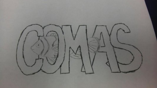
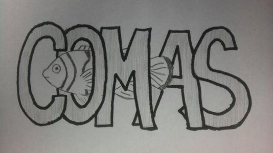
I think it would be nice to keep a clownfish in the logo for continuities sake. I have been playing around with an illustrated picasso clown with "comas" as the stripes on his side. I need to charge my camera batteries to take a pic of them though. The old logo looks a little dated is all. It would be nice to have one that looked a little more current.
lauremf2002
New member
When we get enough rough drafts we could put it to a vote (with the old logo included) and the winner will be finalized for the new logo or we keep the old logo. How does that sound?
chaderic26
New member
Would be a shame to lose the brand. It takes a lot of time and effort to build recognition.imho
lauremf2002
New member
I really dont think alot of people would recognize the old one. To my knowledge its only ever been on the website. But you can surely vote for it if you want to keep it! Anyway, here are the one's I have been working on...
<a href="http://s972.photobucket.com/albums/ae208/lauremf2002/?action=view¤t=comas002.jpg" target="_blank"><img src="http://i972.photobucket.com/albums/ae208/lauremf2002/comas002.jpg" border="0" alt="Photobucket"></a>
<a href="http://s972.photobucket.com/albums/ae208/lauremf2002/?action=view¤t=comas001.jpg" target="_blank"><img src="http://i972.photobucket.com/albums/ae208/lauremf2002/comas001.jpg" border="0" alt="Photobucket"></a>
lauremf2002
New member
sorry they are huge and out of focus
Similar threads
- Replies
- 8
- Views
- 521
- Replies
- 66
- Views
- 725