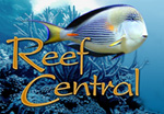
Does this look too fake?

Recty

New member
I was working on the web page for the LFS I maintain and I came up with this for the saltwater fish page banner.

BANNERSW2.jpg


Does that look horribly fake? I dont mean that there is like 8 fish within 10 inches of each other, but I mean does it look all superimposed and totally unreal?

The flame angels look fake to me, but the rest I think looks good.
 
From a design stand point the fish are very well put together.
I do think that the fish are the focal point and the text is washed out. I would focus on making the text pop out. Instead of making the text an outline with an outer glow make it bright orange or a color to compliment the fish. Its a great concept but the fish are over powering the LFS Name. Just my 2 cents. Great Job BTW!
 
<a href=showthread.php?s=&postid=15230534#post15230534 target=_blank>Originally posted</a> by truthdesigns
From a design stand point the fish are very well put together.
I do think that the fish are the focal point and the text is washed out. I would focus on making the text pop out. Instead of making the text an outline with an outer glow make it bright orange or a color to compliment the fish. Its a great concept but the fish are over powering the LFS Name. Just my 2 cents. Great Job BTW!
I like the clear look though, it lets you see the background still. I did it for all the banners across the top of the page.

Anyway, here were some other attempts, I still think I like clear the best.

test.jpg


test1.jpg


test2.jpg


test3.jpg


test4.jpg
 
Very good job! The image does not look fake to me. I get a sense that it's feeding time and the fish are anticipating chow.

My two cents, the fish do dominate the "empty" letters, meaning that if I'm trying to emphasize / call attention to the name of the store, it's not as powerful for that as the filled letter version. I'm not saying flashing neon orange letters are the way to go, but I think the first and last images with filled letters do a better job of emphasizing the name. While I'm a big fan of "white space", the large empty space around the center looks too empty compared with the rest.
 
I know what you mean about the large open space... however I tried putting fish in there and then the picture just looked too busy and really fake. I even tried just adding an anthias or two and it still pushed it over the edge. Maybe I'll attempt more today after I've slept on it.

I see where you guys are coming from, but that clear text is the standard for the site. I'll link up the other banners from the other pages. Of course, I could always color up the text on all of them, but for some reason I like the clear look :P

Home page

BANNERINDEX2.JPG


What You See Is What You Get

BANNERWYS.jpg


Small Polyp Stony Corals

BANNERSP2.jpg


Large Polyp Stony Corals

bannerlps02.jpg


Soft Corals

BANNERSOFT.JPG


Saltwater fish is the one this thread was originally about.

Freshwater fish... I need to redo this one as now that I've done the logo like this, it cuts off the head of the fish and just doesnt look right, imo.

BANNERFW.JPG


Supplies (mainly live rock, hence the picture is their live rock vat)

BANNERSUP.jpg


Services, another one I will redo, probably next month.

BANNERSER.jpg
 
Hey Grant, FWIW I tend to agree that I like the filled in version of the lettering too. I especially like the blue one because it blends better with the fish. Unless you are trying to highlight the live stock in the image over the store name I would do the filled in version (JMHO). IMO also, I think depending on the page and it's intent you'd be fine using filled in letters and outlined on different pages. As long as the Font is the same and in the same location I think that would work.

Are you really worried about it looking "fake"? Composites are tough like that, to get it to look real. I think it looks good as it is. However, I tend to be pretty picky and sometimes get hung up on little things (been told I am a little obsessive :)). When I look at it am sucked right into that empty space like a black hole. There is so much going on that I am just looking there because I expect there to be something and it's blank so I get stuck there. Maybe even just having a blurred coral or some coralline on the rocks would add some balance to it and let me escape back to the rest of the image? It's just too much negative space for me. The other thing that bothers me (I told you I am picky right, and by all means tell me to bug off and disregard any or all of this if you like…just telling what I am thinking as I look at it as if it were my project…and believe me I drove myself crazy for hours messing with this stuff designing my sites!) are the fish. It feels sort of broken to me. Every single fish in there has part of him cut off. If you were going for that frenzied feeding moment with all sorts of action I might have used more a pulled back view. (I think even just moving that Blue Tang (?), Flame Angel, and the Anthias all more into the image (to the right) would help (it would reduce some of that large empty space too). You may even be able to have a few fish with tails :) and I think it would improve the overall feel. I like to have a little breathing room between subjects and the edges of my image. Just my .02 cents.

I don’t know what your original images are like though. You just need to play with these things (and I am sure you have!).
Hope you don’t take this the wrong way. It looks good and is better than lots of stuff people use. Just “thinking” out loud to you. Take it or leave it as you like.

Peace :)
 
Last edited:
Thanks, I do appreciate the advice and the time you took to type that all out :)

So I added a yellow tang, one of the classic saltwater fish everyone loves, it was either that or a clownfish (Nemo) and I went with the yellow tang.

BANNERSW2.jpg


I'm not sure yet on the text coloration yet. I've already moved to clear text with all the banners and the owner and myself really like it, so I think I'll stick with that for a while. This web page is a work in progress, I'm always making little edits here and there, so maybe in a couple months when I feel like doing it ;) I'll change the text to be filled in.

Thanks again for all the advice, guys.
 
I like the banner with the yellow tang and I think you should use the orange color you used for the middle banner in the third post. try that.
 
<a href=showthread.php?s=&postid=15235744#post15235744 target=_blank>Originally posted</a> by IPT
No Nemo, No Dory....what is the world coming too ?!
Well the idea is that they have fish no one else has :) if I start using clownfish and regal tangs, that's going to ruin the whole concept of rareness. Although I used a yellow tang so that pretty much ruined it anyway.
 
This is very well done work! I prefer the red or grey text personally. The clear text presents the photography better, but having viewers remember the text is the whole idea!
 
I think that Tang looks good :). I was just bustn' your chops anyway about Nemo and Dory. Though I do happen to like regal tangs...too bad they get so dang big. You could always swap the tang out for a Mystery Wrasse :).
 
True, and that would look good in there. However, I dont have a picture of a mystery wrasse ;) I'm trying to just use pictures I've taken and are actual fish in their store, not just ones I've gleaned off googles image search.
 
Understood, and applauded. I've never seen one in person but the colors sure look cool. Wonder how one would do in the realy large tank. It's like 600 gallons isn't it? They should taotally get one (if they can maintain it).
 
I think it's very well done. Only a photographer with experience with photoshop can see the the cut and past blurring.
 
Back
Top