You are using an out of date browser. It may not display this or other websites correctly.
You should upgrade or use an alternative browser.
You should upgrade or use an alternative browser.
My Shadowbox Background Project
- Thread starter euromomtx
- Start date
")
NanoReefWanabe
Active member
Except that left one looks like a cross between grandpaw Simson and the wicked witch.
that's alright the one behind it looks like Danny Devito....
the other thing i was gonna suggest is that there are very few plain rocks insight of a reef scene...you may want to try to incorporate some sort of Coral growth like shapes to them...the odd formosa looking piece or capricornus...
euromomtx
New member
Hey now... stop making fun of my artistry!
I was thinking of incorporating some coral silhouettes like elkhorn, etc. but I think the more detail you provide the more you run the risk of it looking cheesy if it's not quite right, kwim?
I am getting a couple of different kinds of grit to try out on the acrylic. My preferred result still would be for the rocks to be just visible as very fuzzy images.
Something that's there to provide that feeling of depth but ideally unless one pays attention to it doesn't draw then viewers eye to it.
Like here's a cool pic of what I would love to achieve:
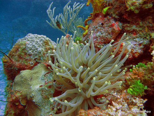
corals in the actual tank shall be the focus,fake rocks in the box should be just a faint image in the back.")
I was thinking of incorporating some coral silhouettes like elkhorn, etc. but I think the more detail you provide the more you run the risk of it looking cheesy if it's not quite right, kwim?
I am getting a couple of different kinds of grit to try out on the acrylic. My preferred result still would be for the rocks to be just visible as very fuzzy images.
Something that's there to provide that feeling of depth but ideally unless one pays attention to it doesn't draw then viewers eye to it.
Like here's a cool pic of what I would love to achieve:
corals in the actual tank shall be the focus,fake rocks in the box should be just a faint image in the back.
NanoReefWanabe
Active member
i agree that looks super cool....keep in mind those rocks in the background are at sea bottom level at least they look like a sand bed carrying through (shaded/less inhabited by showy corals) if you making tall formations they would likely show some sort of growth...Hey now... stop making fun of my artistry!
I was thinking of incorporating some coral silhouettes like elkhorn, etc. but I think the more detail you provide the more you run the risk of it looking cheesy if it's not quite right, kwim?
I am getting a couple of different kinds of grit to try out on the acrylic. My preferred result still would be for the rocks to be just visible as very fuzzy images.
Something that's there to provide that feeling of depth but ideally unless one pays attention to it doesn't draw then viewers eye to it.
corals in the actual tank shall be the focus,fake rocks in the box should be just a faint image in the back.
i have to say love this project, i am planning my next tank around having this shadow box idea...and whatever you dont implement in your testing i surely will and link to this post, but at any rate i am completely inspired by this..great work..

NanoReefWanabe
Active member
now that looks incredible...definitely what i will be doing...cant wait to see it with the water infront of it...
just another idea...not sure if you tried it yet or not...instead of having the light above the box and shining down have you tried with the light standing on edge shining back toward the box/reflecting down? it may give more shadows toward the bottom...not sure though..
just another idea...not sure if you tried it yet or not...instead of having the light above the box and shining down have you tried with the light standing on edge shining back toward the box/reflecting down? it may give more shadows toward the bottom...not sure though..
Last edited:
euromomtx
New member
Nano,
thanks for the ideas! I actually do like the tiny fake gorgos a lot. Looks more and more like the underwater pics. Just couldn't see myself jig-saw hard coral silhouettes so it was perfect that my tank will be mostly gorgonians since that made it possible to just use the tried little plants that grows on dead trees and powerlines and spray paint them.
The retrofit kit I am using actually has a really wide clip on reflector. It clips onto the bulb and I am aiming it towards the back at around 45 degrees. I can control a lot with how this is angled. I didn't know that's what retrofit kits would be like but it turned to be just perfect for my application. I can tweak it some more once everything else is figured out.
NanoReefWanabe
Active member
okay okay...nough talk...put those cut outs in the box, lets see what it looks like through the blue frosted acrylic with the light on already...LOL
euromomtx
New member
still needs a lot of tweaking!
the acrylic isn't blurry enough once it's lit from behind. Getting 400 and 800 grit on Tuesday. Hopefully one of them will be just right. Tried 320 grit before and it was too harsh.
needs to soften the edges of the cuts outs (thinking of using the same paint I used as background and just put a light layer over the edges
It also seems too crammed now. Thinking of dropping the rock on the left or signicantly shortening it.
But here's what it looks today:
The Punisher
New member
Looks good, and I would agree, it seems like it needs to be blurred out a little bit more. You're definitely on the right track though.
NanoReefWanabe
Active member
it looks too well lit....no way to dim the light eh?
i also agree with you...little cramped in there now...depending on how you plan on placing your live rock...i would remove the left one entirely, and separate the other one into two parts and place the other about a 1/3 of the way over...but i certainly dont want you to take it appart only to hate it afterward...gonna take some visualization to get her perfect the way you want it..
maybe like this? sorry it is a crappy MSpaint rendition
Last edited:
euromomtx
New member
Ha I love to plan like that too.
I actually cut them apart when you were painting this

(added virtual overflow boxes since I didn't consider them in my original cut out design hence my scene got so wide even though 1/3 was never going to be visible
I am going to make Marcos style rock covers for the overflow boxes and place my nylon rod-ed rock structures in front of that. similar to this. might move left mountain toward center a bit.

Lighting is actually not as bright as it appears in the pictures. It's the main light source in the room so the camera really picks up on the light
I actually cut them apart when you were painting this
(added virtual overflow boxes since I didn't consider them in my original cut out design hence my scene got so wide even though 1/3 was never going to be visible
I am going to make Marcos style rock covers for the overflow boxes and place my nylon rod-ed rock structures in front of that. similar to this. might move left mountain toward center a bit.
Lighting is actually not as bright as it appears in the pictures. It's the main light source in the room so the camera really picks up on the light
NanoReefWanabe
Active member
ahhhh....boo to the overflow boxes...no way around though i guess now...still looks smokin good though...

I don't know if I'm in love with the cutouts, maybe its because the painting on your edges is softer, i think you need a harsh gradient for it to pop but stay in the background... do a side by side of your then the original, don't forget to try lighting it from the front to see what it looks like with tank lights on.
Similar threads
- Replies
- 4
- Views
- 235
- Replies
- 2
- Views
- 566
- Replies
- 5
- Views
- 320